Igrid – Test Post


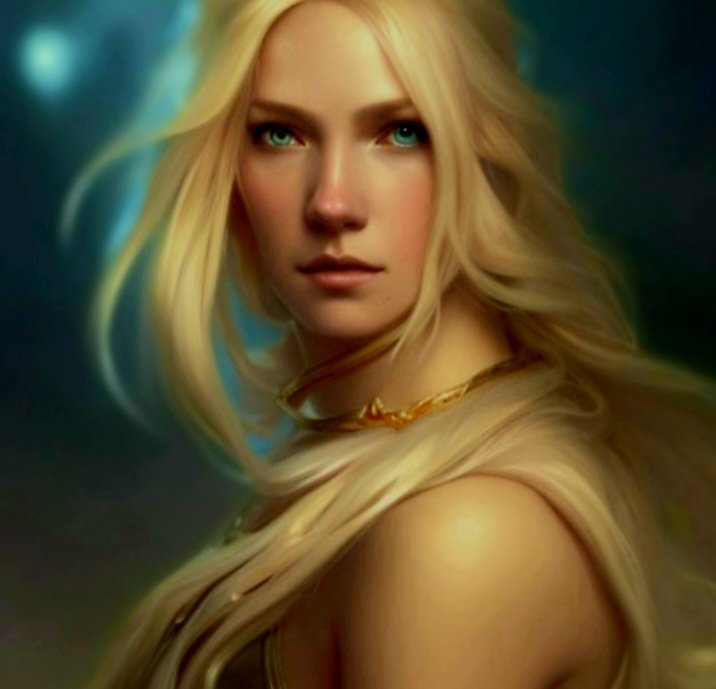
This is just a test post, really, to check the images after a tweak I’ve made in the media settings. The image is an adapted AI creation. The name Igrid came to me as I was making a few changes to the picture, so perhaps she may appear in a future story.

Here’s hoping the image is just right… not too small and not too large. I’m not expecting perfection, but something good will be a bonus!

Igrid. Hopefully not visible from the Moon!

10 responses to “Igrid – Test Post”

  1. lampmagician avatar

    The beauty can be as big as it might be! πŸ˜ŠπŸ‘

    Liked by 1 person

    1. Tom avatar

      Although that may be so, LM, I would rather my visitors didn’t get repetitive strain injury in their scrolling finger to get to the text of the post! 🀣
      All I want is a decent size! Sigh πŸ˜•!

      Liked by 1 person

  2. Visionkeeper avatar

    The main top image I can see from the moon….Will it always be so big? Otherwise Ingrid is great! VK

    Liked by 1 person

    1. Tom avatar

      Thanks, VK, and all I can answer your question with is ‘your guess is as good as mine!’ 🀯
      The main top image, I think, will be the feature image, which is needed to appear on the homepage. I’m posting on my mobilius phoneus (don’t shout! 😊🀣), and the top image there, when viewed in the browser, is smaller than the bottom image. However, the image on the homepage needs a magnifying glass to be viewed.
      Gah! 😳😑
      Igrid was quite a good creation, I thought so too! πŸ™‚

      Liked by 1 person

      1. Visionkeeper avatar

        I don’t know what you are seeing there, but when I went to your site the main picture takes up almost the entire page….Massive….Just letting you know. I think maybe you can see Ingrid from another dimension…. VK πŸ™‚

        Liked by 1 person

        1. Tom avatar

          Maybe that’s where she’s from, VK! I’ve just checked a WP help guide, which has given recommended sizes. Maybe I have mine set in miles rather than pixels! Doesn’t explain the difference in computer and mobile browsers, though.
          I’ll keep tweaking! πŸ™„πŸ™‚

          Liked by 1 person

  3. rugby843 avatar

    Looks good. I find if I don’t stick to med or thumbnail it’s huge even though the preview doesn’t show it that way.

    Liked by 1 person

    1. Tom avatar

      Thanks, Cheryl. πŸ™‚
      You’d think someone would’ve spotted that when they went through the design process, though, wouldn’t you! πŸ€”πŸ™„

      Like

  4. europasicewolf avatar

    The image is awesome Tom and perfect for viewing in the phone πŸ‘πŸ˜ƒ Although I haven’t viewed it on the much larger laptop screen, I do know from painful experience πŸ˜€ that most images look massive and humongous on WP seen that way. Even after setting custom sizes in the editor the “live” onscreen view is still enormous! I’ve often wondered how my post images really look to others! Seems to me the mobile phone screen is by far the best place to view them properly, where they are all present and correct, perfectly sized and not at all wonky and unaligned in anyway!! So, yeah….for me, your image is perfect! 🀩

    Liked by 1 person

    1. Tom avatar

      Another AI one, Icewolf.
      I worked out how to get the images looking better on the desktop, only for it to throw out the look on the mobile! So another hasty rejig ensued and things are now as they are. The piccies aren’t that massive on the desktop anymore! πŸ˜πŸ™„πŸ˜Š

      Like

Leave a reply to Visionkeeper Cancel reply

This site uses Akismet to reduce spam. Learn how your comment data is processed.